


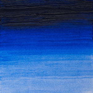
Opaque and transparent pigments in oil painting
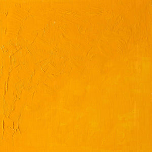
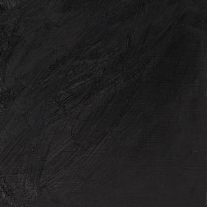
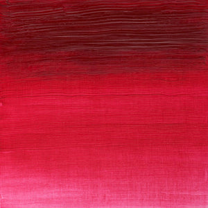
This masterclass demonstrates the differences between opaque and transparent oil colours, using a palette of primaries that includes an example of each. The colours used are Cadmium Yellow, Transparent Yellow, Cadmium Red, Permanent Rose, Cerulean Blue and Ultramarine Blue. The qualities of each paint are demonstrated by pulling them down a white board and across a solid black line to clearly show the distinction in coverage between the opaque and transparent paints. The opaque colour obliterates the black whereas the transparent colour allows it to show through.


![WN PWC KAREN KLUGLEIN BOTANICAL SET [FRONT]](http://www.winsornewton.com/cdn/shop/files/136444.jpg?crop=center&v=1740654068&width=20)
![WN PWC KAREN KLUGLEIN BOTANICAL SET [OPEN 2]](http://www.winsornewton.com/cdn/shop/files/136447.jpg?crop=center&v=1740654068&width=20)
![WN PWC ESSENTIAL SET [FRONT]](http://www.winsornewton.com/cdn/shop/files/137583.jpg?crop=center&v=1740762356&width=20)
![WN PWC ESSENTIAL SET [OPEN]](http://www.winsornewton.com/cdn/shop/files/137581.jpg?crop=center&v=1740762356&width=20)
![W&N GALERIA CARDBOARD SET 10X12ML [B014096] 884955097809 [FOP]](http://www.winsornewton.com/cdn/shop/files/138855.jpg?crop=center&v=1740761853&width=20)
![W&N GALERIA CARDBOARD SET 10X12ML 884955097809 [OPEN]](http://www.winsornewton.com/cdn/shop/files/138856.jpg?crop=center&v=1740761853&width=20)

![W&N PROMARKER 24PC STUDENT DESIGNER 884955043295 [FRONT]](http://www.winsornewton.com/cdn/shop/files/78674_d4d78a69-7150-4bf4-a504-3cb5304b0f80.jpg?crop=center&v=1721326116&width=20)

![W&N PROFESSIONAL WATER COLOUR TYRIAN PURPLE [SWATCH]](http://www.winsornewton.com/cdn/shop/files/136113.jpg?crop=center&v=1724423390&width=20)
![W&N WINTON OIL COLOUR [COMPOSITE] 37ML TITANIUM WHITE 094376711653](http://www.winsornewton.com/cdn/shop/files/9238_5073745e-fcfe-4fad-aab4-d631b84e4491.jpg?crop=center&v=1721326117&width=20)
![W&N WINTON OIL COLOUR [SPLODGE] TITANIUM WHITE](http://www.winsornewton.com/cdn/shop/files/131754_19b392ee-9bf6-4caf-a2eb-0356ec1c660a.jpg?crop=center&v=1721326118&width=20)